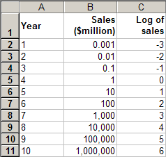
| Let's look at a fast growing market example. Imagine that a product has been on the market for ten years. The first year sales were only $1,000 (.001 million), but sales picked up rapidly, increasing by a factor of 10 times each year. The sales data are shown in the first two columns of this spreadsheet. |  |
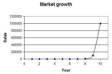
| This graph shows a plot of sales versus time. As you see, the growth in the last year was greater than the previous years combined. The early part of the graph appears to be almost flat, since the range on the Y axis has to be large enough to show the later, higher values. This graph is accurate, but does not give a picture of the growth during the first eight years |  |
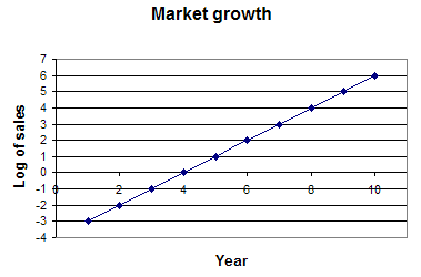
| Here we see a plot of the log of sales versus time. The log of a number is the power to which 10 must be raised to get that number. For example, since 10^2 = 100, the log of 100 is 2. As you see, plotting the logs compresses the Y axis (the log of 1,000,000 is only 6), so we get a better overall picture of the growth. |  |
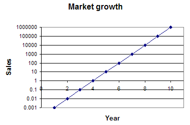
| We can also see the growth in the early years by plotting the sales, but using a logarithmic scale for the Y axis. Note that the distance between, say, 1 and 10, is the same as the distance between 100,000 and 1,000,000. |  |
As you see, logs are convenient when trying to describe numbers that have a very large range, like our hypothetical product or the difference between transmitted radio power and the much weaker signal received at a distance.
Note also that when you have a constant growth rate, a graph of the log of the data is a straight line. In our sales example, we have a constant growth rate of ten times each year, and the log plots are straight lines. (Growth at a constant rate like this is often referred to as "exponential" growth").
Here are a few more logarithm examples: