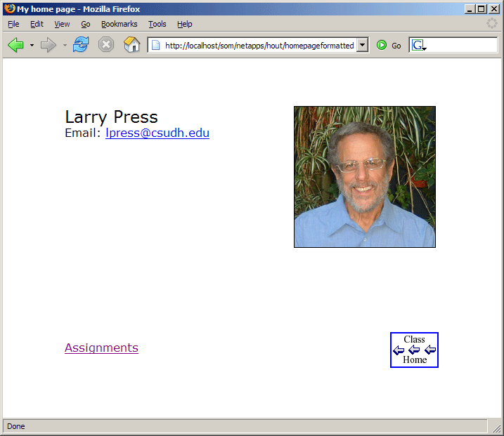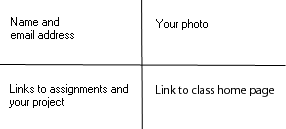
Use a table to format your home page like this:

I created this layout using a 2 by 2 table:

Your photo should be 200 by 200 pixels. Use an image processing program to make it look good and fit in that space. (Do not use the image height and width attributes).
The Font is Verdana, and the text Size of my name is 5, making it a bit larger than the other text. The table is centered on the page, and I spread the cells out by setting the value of the table Cellpadding property to 75 pixels.
The links are hot, as is the Class Home logo. When the user clicks on that, the browser returns to the class home page.
You can use this image for the Class Home logo: ![]()
Place all of your assignments in a subdirectory of your directory on the Web server. (You will not get credit if you leave all your files in one directory). Name the subdirectory assignments.
When your home page is in the correct format, use it to replace the one currently on the server -- make it your new index.htm file.
Print and turn in a screen shot of your home page and a listing of the HTML.