Home pages

Web sites often, though not necessarily, are designed with a home page. Starting at the home page, one should be able to navigate to anywhere else on the site. It is often, though not always, the first page a new visitor will see. (Search engines links typically take one to subordinate pages). You might think of it as the front page for the site -- combining the functions of an attractive cover and the table of contents page for a book.

If the file name for your home page is the default file name for your Web server, users will be able to retrieve it without typing the file name.

Web designers typically plan three aspects of a home page:

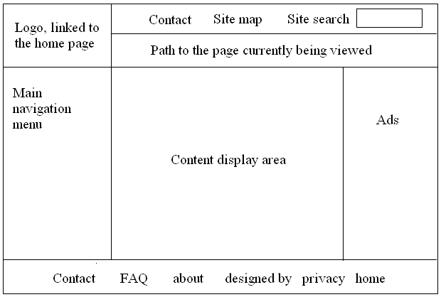
The plan is often done as a simple wire frame diagram like this:

One should always consider the user in home page design. Why are they coming to your Web site? What sort of hardware and Internet connection do they have? Are they sophisticated Internet users? Etc. Etc. Note that a home page does not have to be complex. Consider Google.com, which is focused on what the user most likely wants to do and very simple to use.

We will create a home page for our class, which will contain links to each student's home page. Ours will be very simple -- we will focus on navigation, ignoring graphic design.

For more on page design, check out Jakob Nielsen's Alertbox site.


Disclaimer: The views and opinions expressed on unofficial pages of California State University, Dominguez Hills faculty, staff or students are strictly those of the page authors. The content of these pages has not been reviewed or approved by California State University, Dominguez Hills.